One of the things that Wave has recently transitioned from having the Flex Designer as BETA and making it now the Standard Wave Dashboard Designer. Now that it is out of BETA we have tons of new features available that really allow you to create some fantastic layouts tailored to different devices and screen resolutions. The beauty of the Flex Designer (now called Wave Dashboard Designer), is that it would change the different charts, filters, and other pieces of your Dashboard based on the size of the monitor. Note: there were previously other ways of doing this, but now Salesforce has made this extremely easy!
When you’re editing your Layout’s properties, you now have the option to control the amount of columns and their spacing. This gives you more control than before when you’re trying to make a beautiful dashboard.

Columns determines how many columns your Grid will have. The more you have, the more control you have with your different dashboard elements. I’ve yet to hear of any downsides for bumping it up to 50 columns (the max).
Cell Spacing is how much space is between the different cells or blocks on your grid. You have the option of 0, 4, 8, and 12.
4

16

The Maximum Dashboard Width plays into our next section on the Layout editor, Device. This is where we get to control what devices and monitors will work with this Layout.

Screen Width allows you to set ranges that this Layout will work for. In this image, I’m creating this for really large screens only, and I’ve just set a minimum width for the layout. For my Standard layout I used both the minimum and the maximum width values. Note: these numbers are in pixels.
Orientation is whether or not you want to make the Layout only work for Landscape or Portrait orientations. It defaults to all, but having the ability to dynamically change it also based on the device’s orientation is fantastic!
Platform allows you to determine if your Layout works for iOs, Android, or both.
How does it all tie together?
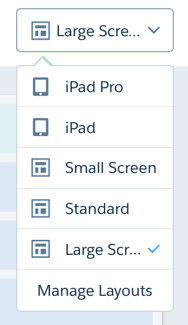
When you’re editing your Dashboard you’ll see your Layout dropdown to the left of the back and forward arrows. You can see here that I’m able to create my own Layouts for one Dashboard. This gives you full control now over how the Dashboard will look at multiple aspect ratios.
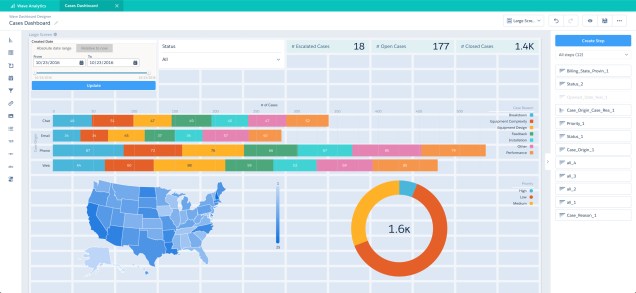
Let’s take a look at this in action. Below, I’m presenting you two very different Dashboard Layouts inside the same Cases Dashboard! The first screen shot is for Large Screen Users, and the screen shot is for iPad Pro Users. Notice, I can now add a variety of charts and filters based on the specific layout without any heavy lifting!
Large Screen View
iPad Pro View

 Salesforce Sidekick